3 charts that show what happened in Canada the last time the yield curve inverted
February 10, 2020
Erik Fertsman
Nearly 7 months ago, the interest rate on the 10-year Government of Canada bond dropped below that of the 2-year bond. Since then, bond investors have been getting less interest on longer-dated versus shorter-term Canadian bonds. This "yield inversion" has been a reliable indicator of an impending recession. Yet, stocks and home prices are still in a bull market, and national employment and GDP levels are still growing. Has the threat passed? Here are three charts that show us we're not out of the woods yet.
ARTICLE CONTINUES BELOW
Stocks could tumble as much as 16 months later...
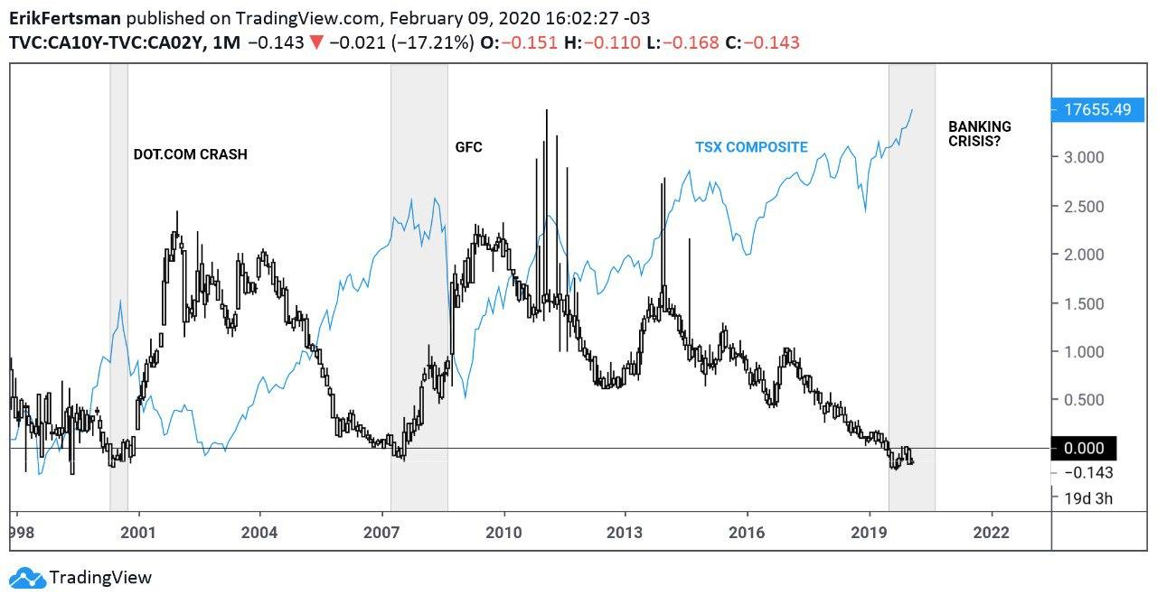
On the chart above we can see that the difference between the 10 and 2-year GOC bonds is now at a negative value of -0.143%. The last time the spread went negative was back in 2007 before the Great Financial Crisis (GFC) and in 2000 before the Dot-com crisis. The Dot-com crisis saw companies go insolvent, while the GFC was a full-blown banking crisis. The causes of both were clear: banking regulators allowed far too much bank credit into real and financial assets. Even though these crises were largely US-originated busts, Canada was not immune (we suffered from the same regulatory problems). As you can see on the chart, the TSX composite index crashed on both occasions.
It's important to note that the inversion of the bond yields preceded both events. In other words, they were a warning of sorts. The TSX dropped into a bear market about 6 months after the inversion in 2000, while it took almost 16 months for stocks to tumble after the inversion began in 2007. It has been 7 months since the yields first inverted in 2019, but stocks are currently breaking all-time highs. Realistically, the bull market could continue for another 6 to 9 months before we see supports fall apart in the stock market.
The Canadian dollar is looking weak against the US dollar...
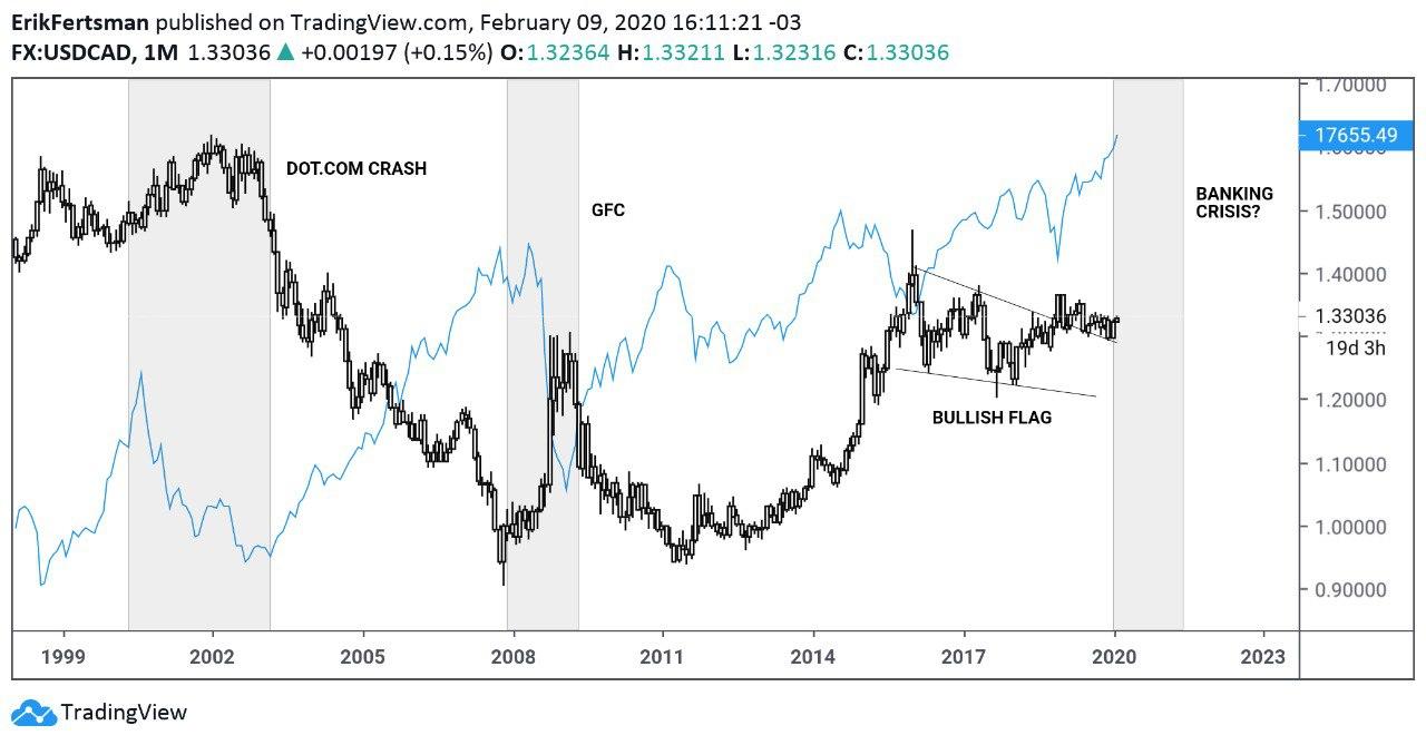
Here's another chart that shows there are some risks ahead. FX market specialists have been watching the bullish pattern forming in the USD/CAD market. On the chart above we can see the formation of a bullish flag, which is likely to lead to a significant devaluation of the Canadian dollar versus the US dollar. In the context of the yield curve and previous recessions, this makes sense. During the Dot-com crash, the CAD devalued against the USD alongside the crash in the TSX. Meanwhile, the CAD strongly devalued against the USD during the GFC.
According to the data above, we could see a similar thing play out in the coming months in the FX market, with the CAD devaluing against the USD once things start to go south in the stock market. The severity of the devaluation will likely hinge on how hard bank stocks get hit, since they will reflect non-performing loan problems which have the most devastating effects on currency valuations.
Bank stocks haven't grown in 2 years...

View more
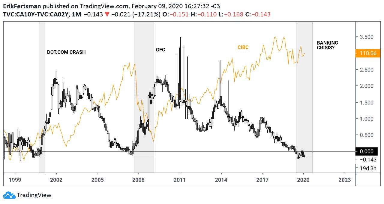
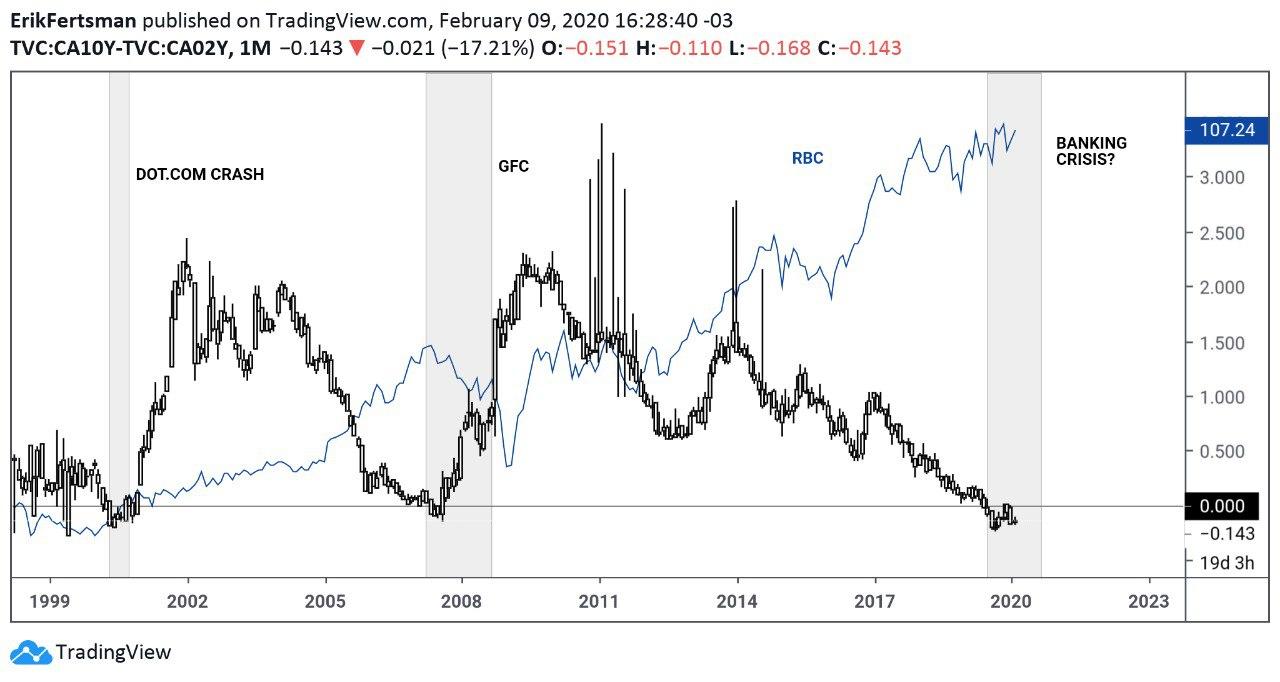
Indeed, the most worrying chart is perhaps that of any bank stock in Canada. CIBC, RBC, and TD, for example, haven't seen their stocks grow to new highs in 2 years. Yet, they've been increasing the assets (loans) on their balance sheets significantly. When bank stocks fall or don't keep up with the pace of growth in loans, their equity ratios erode. This has a net negative effect on lending, since banks must maintain a favorable equity-to-asset ratio. To make matters worse, the value used to represent "assets" in the ratio is calculated by using risk-weights. A sudden deterioration in the economy can significantly impact the equity-to-asset ratio. What's more, a sudden contraction in lending could be devastating, because credit growth is crucial for sustaining Canada's financial and real estate bubble.
Banks have been slowly and quietly putting money aside in the form of "loan-loss provisions," but investors are a bit worried about what will happen to them during an economic downturn given the very high debt-to-income ratios in Canada. RBC and TD are now global systemically important banks (G-SIBs), holding hundreds of billions worth of assets each. But their loan-loss provisions are in the millions, not billions. These banks, especially CIBC, are sitting mostly on mortgage loans. Based on the chart above, bank stocks really got hurt the last time the yield curve inverted. Will this time be similar or different?
It's probably best to play it safe and assume the effects of the yield curve inversion have yet to materialize.
Cover image by: Illia Cherednychenko via Unsplash
SHARE THIS ARTICLE
Enjoyed this article and want to support our work, but are using an ad blocker? Consider disabling your ad blocker for this website and/or tip a few satoshi to the address below. Your support is greatly appreciated.
BTC Address: 13XtSgQmU633rJsN1gtMBkvDFLCEBnimJX